What is a Pedigree Reverse-Timeline?
A Pedigree Reverse-Timeline is a modification of a Pedigree Chart.
Like a Pedigree Chart the most recent individual is on the left. The father is indicated above the individual and the mother is indicated below. Essentially a hierarchy is created. And also like a Pedigree Chart each person is numbered with the father's number being twice that of the child's number and the mother's number being one more than the father's.
Unlike a Pedigree Chart, a Pedigree Reverse-Timeline displays the information on a timeline and shows the lifespan of each person. Since the most recent individual is on the left, the most recent date is also on the left providing a reverse timeline.
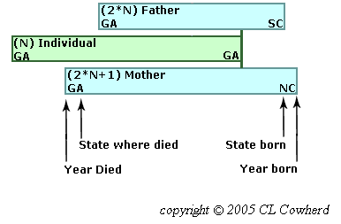
To better highlight migration, the states in which an individual resided at birth and at death are also shown. The background color for each generation is unique.
How can I find a person on the Pedigree Page?
In addition to scrolling up and down the page, there are at least three other ways to find a person on the Pedigree Reverse-Timeline Page.
- In the drop-down list of the selection box in the upper left corner of the page, click on the name of the desired person.
This is for parents, grandparents, etc. plus any spouses of these that had children. People are listed in alphabetical order by surname. Maiden surnames are used for women. Additional spouses are indicated at the bottom of the list.
- Click on the name of the person in the Pedigree Reverse-Timeline Chart
Currently this feature does not work on cell phones and may not work on other devices when the image height is resized or if the width is significantly reduced.
- Use the "Find" sub-menu option of your browser to enter some unique part of the person's name. The "Find" submenu option is often under the "Edit" menu but most browers also support using <ctrl>F.
This can be used to look in the current page for a person that is a sibling or the spouse of a sibling as well as for a parent or grandparent.
What does the blue right arrow  mean ?
The blue right arrow next to information about a person on the Pedigree Page means there is additional information that can be displayed. Often it is military information about a sibling. Or it could be the text of a document, such as an orbituary.
On non-touch screen devices hovering the cursor over the arrow will display additional information on top of the existing information. Moving the cursor off the arrow will cause this additional information to disappear.
On touch screen devices a click on the arrow will display the additional information, again on top of the existing information. This should also bring up a "close" button in the left of the table. Clicking this button will cause this additional information to disappear. (If the close button did not appear, additional clicks on the arrow should bring it up. Different touch screen devices work differently. If all else fails, click on any TOP button.)
What is going on in the Migration Page?
The design for the Migration Page is different since it contains two inline frames.
- There will be a scroll bar on the right edge of the screen when the inline frames plus the header and the footer exceed the heigth of the page. This allows you to scroll up and down in the page.
- There is also a scroll bar on the right of each frame since only part of the content can be displayed in the frame. Each scroll bar allows you to scroll up and down in that frame.
Note: When the screen is wide enough, the two frames will be displayed side by side. Otherwise, they will be stacked with the "Who was Where When" frame on top and there will be buttons added to make it easier to jump to the top of each frame.
- "Who was Where When" frame
In addition to scrolling up and down this frame, people residing in a given state and county can be found by
- Clicking on the name of the desired state and county in the drop-down list of the selection box in the upper left corner of this frame
- Clicking on text at the desired location on the map when the map frame is displayed on the right of the screen. in the frame to the left. Some of the text locations on the map are for reference only.
Currently this feature may not work when the image height is resized or if the width is significantly reduced.
Note: Births, marriages, and deaths are only included when they are the only indication that a family was in a given state and county at that time.
- "Various Locations Mentioned and Historical Dates" frame
In the drop-down list of the selection box in the upper left corner of this frame,
- Click on the name of the desired map to display that map image
- Click on 'View Maps' to see each of the maps displayed about 2 seconds apart
A list of historical dates of interest are provided below the map image.
What is the significance of the colored backgrounds for individuals?
The background color for each generation is unique. This background generation color scheme is used in the Pedigree Reverse-Timeline Chart, in the title indicating the details for an individual on the Pedigree Page, and in the 'Who was Where When' individual listing on the Migration Page.
| individual |
| parents |
| grandparents |
| great grandparents |
| 2-great grandparents |
| 3-great grandparents |
| 4-great grandparents |
| 5-great grandparents |
| 6-great grandparents |
| 7-great grandparents |
| 8-great grandparents |
How do I return to the Welcome (Home) Page?
If you want to return to the Welcome Page (also called the Home Page),
- Click on the Quilt icon in the upper left corner of any page
- or Click on the Home button in the Navigation Bar at the top of the page
- or Click on the Home button in the site map at the bottom of any page.